- Good use of logos, layout and use of stars
- use a clearer font and the photos meed more style and effects to impress
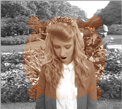
- Good pictures they look professional
- The font is a good font and compliments the poster well
- The bottom of the poster doesn't look as good as the rest of the poster, the bottom could be black like the top to make it look more professional
- The use of logos works really well in order to make the poster look professional
- The layout of the poster is well thought out and represents the artist and genre really well
- The pictures are clear and professional
- The use of the stars and rating makes the poster look professional
- Could have included a release date
Question 4) How did you use new media technologies in the construction and research, planning and evaluation stages?


 Throughout all stages of the task, I have used a variety of products, whether this be new media technologies, or using technologies I've used previously to a higher level. We filmed our music video on a JVC everio HD. Chloe and I used this camera for our media project at AS level. Therefore we knew how to use the camera, and what to do to ensure we got the best possible shots. This would include the different angles I
could point the camera in, as well as using a tripod for a steady shot
or using the camera hand held for the shots we wanted to create a home filmed feel.Chloe and I also used our phones a lot for the construction stage. I used my Sony Xperia U in order to take pictures of our model throughout the process, as well as using it to contact Chloe and our character, to arrange filming dates as well as sending pictures to one another of existing images we thought we would be able to incorporate into our music video. Using our phones allowed us to quickly and easily get hold of one another in order to change plans if the weather was going to effect filming. I also used my Sony Xperia U to take pictures of our character for my digipak and poster. My phone has a 5 MP, 2592 x 1944 pixels, autofocus, LED flash camera, therefore I knew it would produce clear, professional looking shots. However some shots did not come out a clear as I had hoped therefore using Photoshop would allow me to edit these pictures in order to gain a picture that I was happy to use on my ancillary texts.
Throughout all stages of the task, I have used a variety of products, whether this be new media technologies, or using technologies I've used previously to a higher level. We filmed our music video on a JVC everio HD. Chloe and I used this camera for our media project at AS level. Therefore we knew how to use the camera, and what to do to ensure we got the best possible shots. This would include the different angles I
could point the camera in, as well as using a tripod for a steady shot
or using the camera hand held for the shots we wanted to create a home filmed feel.Chloe and I also used our phones a lot for the construction stage. I used my Sony Xperia U in order to take pictures of our model throughout the process, as well as using it to contact Chloe and our character, to arrange filming dates as well as sending pictures to one another of existing images we thought we would be able to incorporate into our music video. Using our phones allowed us to quickly and easily get hold of one another in order to change plans if the weather was going to effect filming. I also used my Sony Xperia U to take pictures of our character for my digipak and poster. My phone has a 5 MP, 2592 x 1944 pixels, autofocus, LED flash camera, therefore I knew it would produce clear, professional looking shots. However some shots did not come out a clear as I had hoped therefore using Photoshop would allow me to edit these pictures in order to gain a picture that I was happy to use on my ancillary texts. Media technologies I have previously used include Adobe Premierpro and Photoshop. However these were both used to a basic level. For example I used Adobe Premier pro, however only to a basic standard, whereas during the construction of our music video we developed these skills. We had to do this in order to ensure the lip syncing throughout the video was on point. To do this we had to cut down each clip to the exact same place as the track. Sometimes our character sang too fast or too slow. Therefore this meant cutting the clip more than once then slowing parts down and speeding other up, we then had to put the clips back together to ensure during the video the audience do not see a jump between the different clips.
During the construction of our music we edited a number of shots in order to maintain the vintage theme throughout. This required layering effects on top of the shots and experimenting the the different settings in order to ensure that the settings are best for the genre and narrative of the video. After finding the correct effects, I then ensured each clip was edited in the same way. This was essential as it is important that there are no jumps within the video, as it will be really noticeable and will make the video look unprofessional. We slowed down and sped up a number of shots, we did this in order to fit them into the narrative of our video. A lot of shots were edited to look grainy, like a home made video. This was done on purpose in order to show the difference in time throughout the narrative. The shots made to look like a home video were used to show summertime whereas the more vintage shots showed present time. During the construction stages of the music video I felt I thought about the editing in more detail i did this by thinking about what methods would work well in order to represent the artist and the narrative well, in order to please the audience. Photoshop was used to make my ancillary texts, this required me to use a number of layers in order to blend my photographs into their backgrounds. As well as cropping and using the lasso tool to crop the pictures so they are precise. I used a number of layers on each panel of my digipak. For example on the photo panel, there was a background, then on top of the background was a close up of lips with a layer of text on top.

Using the skills I have developed by experimenting with different tools on photoshop allowed me to do this. I also used photoshop to edit my photographs. The photos I took were originally in colour, by using the colour change tool on photoshop I was able to change the photos so they were in black and white. The photos I kept in colour I still edited them so they complimented the vintage theme I wanted to achieve.
During the evaluation stages I used Prezi, Powerpoint and Slideshare, these are all media technologies that I have used before, therefore I knew how to use these programs before it came to me evaluation. However, I have only ever used Prezi for basic presentations, whereas my evaluation used a large number of paths, this meant I had to edit the order of my path, and add a large number of text boxes and ensure they were in the right position in order for the Prezi to flow. I also incorporated different forms of media onto the prezi which I had not done before, for example, the powerpoints I had made were added onto the prezi through the use of a hyperlink. I also added youtube videos. Through out the different stages of Chloe and I's music video I have developed my skills on these media technologies, which I feel I can not put into use for different projects. I now also feel confident using these media technologies and feel I can put together a well thought out project which I know I have been put together to the best of my ability.


Throughout the research, and evaluation stage I had difficulties using slideshare, as it was often the case that the website was not working and wouldn't let me upload the powerpoint I wanted. Therefore I had to research into similar programs which would let me upload the powerpoint. I came across auto stream which allowed me to upload a powerpoint and embed it into my blog, like I would have done with slideshare. Through out my evaluation I wanted to use as many different formats of presentation as possible. I came across glogster, which allowed me to present my ideas in a poster form them embed it onto my evaluation. I used the presentation method when writing about my audience feedback.


